The Silent Hero
- Mar 13, 2025
- 2 min read
Happy Friday,
How was your week?
Mine was beeesyyy on all fronts, and I'm glad it's takeout and movie night at my house.
Today, I felt like zooming into one of the most used tools in a brand builder toolbox, the logo.
But what makes a good one, you ask?
Simplicity for one | Making it memorable and easily recognizable from up far
Relevancy | Embodying what it stands for, its values, purpose and in the industry
Timelessness | And stand the test of time and endure trends.
Even if your logo isn't your brand, it can be an accelerator of what they're all about.
And leveraging established codes reinforces what the brand stands for in the eyes of its best brand ambassadors, the consumer.
Its shape alone will help signal specific attributes:
Circles will signal discovery, and having softer lines feel more welcoming
Straight lines and right angles will give you a sense of reliability and trust
Triangle will trigger movement since we can't help ourselves following the lines
The stronger the logo, the more memorable it becomes. And if and only IF consumers can recognize it in its most naked form (swoosh), you have a true winner. One could argue that colour could do the same thing as a stand-alone (blue)
The real fun begins when you can show only part of your logo to signal your brand essence. Insurance, for example, is having a moment with it, reinforcing protection when positioned cleverly.
McDonald's, the 2018 Cannes winner, triggered strong brand recall and signalled direction to their nearest location with only logo snippets for their Follow the Arches campaign.
Kellogg's See You in the Morning latest campaign uses part of their iconic logo to reinforce that they are undoubtedly the original gangster of cereals.
And sometimes, the challenger brand borrows your codes to disrupt and reinforce their attributes (zero sugar) on your equity.
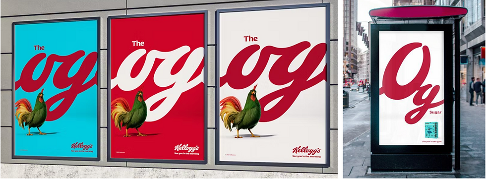
Who doesn't like a little chaos with your morning cereals?
See you next week

Comments